The Role of Color Psychology in Commercial Interiors: Choosing the Right Paint for Your Business
When a customer, client, or employee walks through your doors, the space immediately communicates something, whether you intended it or not. The good news? You can control that message, and one of the most effective ways to do it is with color.
Paint plays a powerful role in setting the tone of a business. From sparking creativity in an office to building trust in a medical clinic, the colors on your walls influence how people feel, think, and behave.
Understanding how colors affect mood and perception can help you choose a palette that not only looks great but also supports your business goals. Let’s take a closer look at what different colors can do for your commercial interior.
Why Color Psychology Matters in Business Spaces
Studies show that colors impact everything from productivity to customer decision-making. In a commercial environment, that can translate into real results: higher sales, happier employees, or a more welcoming atmosphere.
Think of it this way: you wouldn’t hold a high-stakes board meeting in a neon-green room, and you probably wouldn’t want a spa painted in fire-engine red. The wrong color creates friction, while the right one sets the perfect tone for your business.
Here are some of the most common commercial paint colors and what they tend to say:
Blue: Trust and Stability:
Blue is one of the most popular choices for offices, healthcare facilities, and financial institutions. It communicates reliability and calm. Think “we’ve got things under control.”
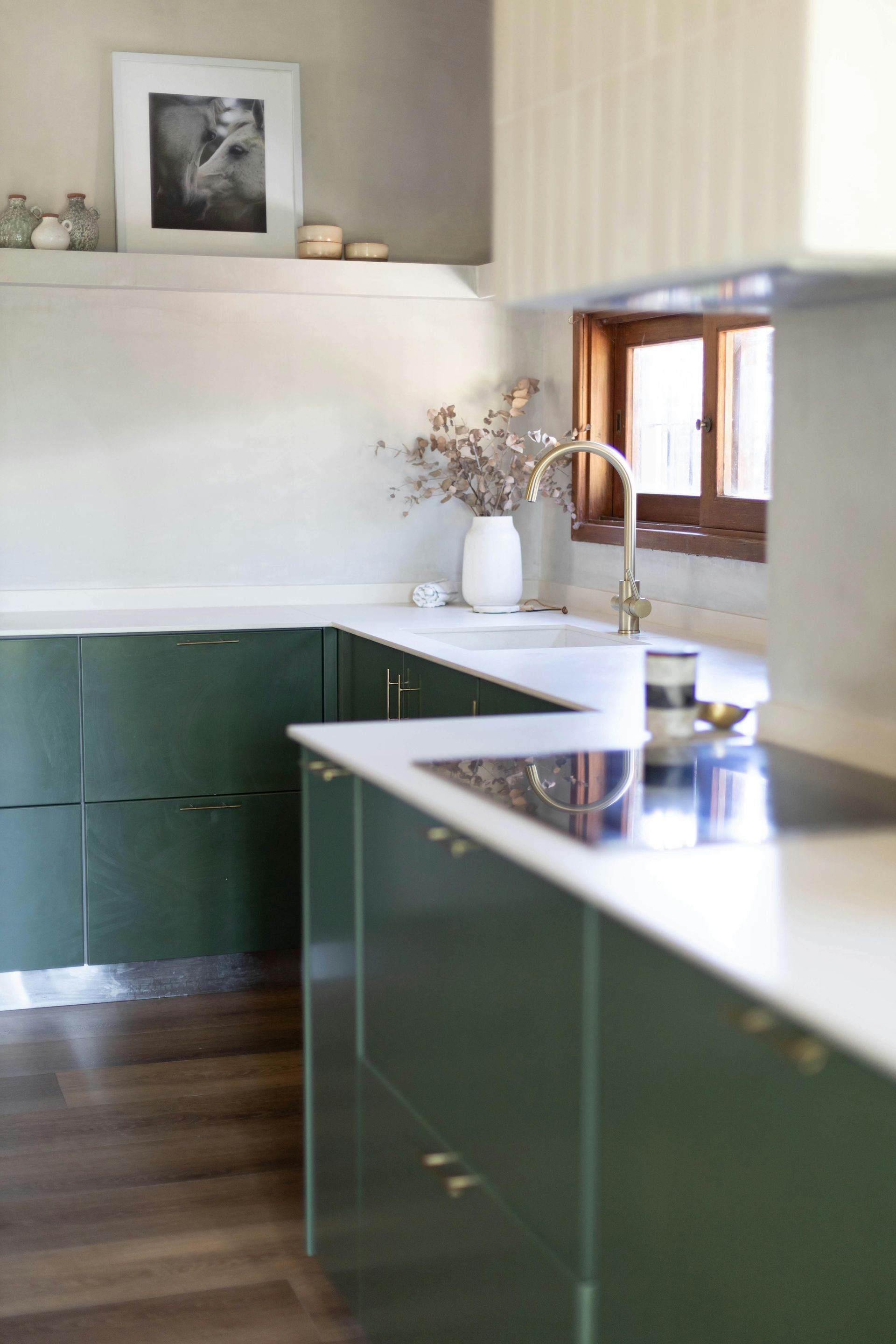
Green: Balance and Wellness:
Green connects to nature, health, and growth. It’s great for wellness centers, medical offices, or any space where you want to promote balance and relaxation.
Red: Energy and Excitement:
Red can stimulate appetite (which is why you’ll often see it in restaurants) and create urgency. In large doses, though, it can feel overwhelming, so it’s best used as an accent.
Yellow: Optimism and Creativity:
Yellow sparks positivity and innovation, making it a strong choice for collaborative spaces. Just keep it soft; too bright and you risk creating stress instead of sunshine.
Gray and Neutral Tones: Professionalism and Versatility:
Neutrals are timeless and flexible. They pair well with accent colors and give a clean, polished backdrop for professional settings like lobbies or conference rooms.
White: Cleanliness and Simplicity:
White can make a space feel larger and more open. In commercial interiors, it’s often paired with accent walls or furnishings to avoid feeling too sterile.

Matching Color Choices to Your Business Goals
Choosing a paint color for your business isn’t just about what looks good on a swatch; it’s about how that color supports the goals of your space. In other words, your walls are doing more than decorating; they’re working for you.
Here are a few ways to connect color to strategy:
Customer Experience:
Do you want customers to linger, or move quickly? Warm, energetic tones (like reds, oranges, or golden yellows) can stimulate appetite and conversation. Cooler, calming shades (like blues and soft greens) create a sense of relaxation and trust, ideal for retail stores or healthcare settings.
Employee Productivity:
The right colors can support focus, creativity, or energy depending on the work environment. Bright, uplifting hues can inspire creativity in collaborative spaces, while muted neutrals or soft blues are better for offices where concentration is key.
Brand Identity:
Are you trying to project creativity, authority, or trustworthiness? A bold palette can reinforce a brand that thrives on innovation, while classic, subdued colors communicate reliability and professionalism. Matching your wall colors to your brand message creates a consistent experience from the moment someone walks in.
Industry Context:
Color psychology doesn’t mean every law office should be navy and every gym lime green, but certain palettes tend to align better with specific industries. Fitness centers, for example, often lean into energetic colors to motivate movement, while spas favor calm neutrals to promote relaxation.
Practical Paint Color Considerations for Commercial Spaces
While color psychology is important, businesses also need finishes and products that last. Here are a few key factors to keep in mind:
Durability:
High-traffic spaces like hallways, lobbies, break rooms, or retail floors need paints that can stand up to scuffs, scratches, and constant cleaning. A washable finish, such as satin or semi-gloss, helps maintain a fresh, professional look without endless touch-ups.
Low-VOC or Zero-VOC:
Paints with low or no volatile organic compounds are better for indoor air quality, which matters when employees, clients, or patients spend hours in the building. They reduce strong odors during application and create a healthier environment overall.
Consistency Across Spaces:
Commercial interiors often span multiple rooms or even entire floors. A cohesive palette helps tie everything together, creating a seamless experience whether someone is walking from the lobby to a conference room or through a series of offices. Strategic accent walls or branded color pops can add variety without losing that consistency.
Lighting and Appearance:
Paint looks very different under fluorescent office lighting compared to warm LED fixtures or natural daylight streaming through windows. Always test swatches in the actual space, at different times of day, before making a final call. What seems like the perfect shade in a sample book could feel too dark, washed out, or intense once it’s on the wall.
In short, choosing paint for a commercial interior isn’t just about picking a nice color; it’s about balancing the science of psychology with the practical realities of daily use.
Bringing It All Together
The colors you choose for your commercial interior are part of your business strategy. The right palette can inspire confidence in clients, improve employee satisfaction, and even encourage customers to buy.
And while paint psychology is fascinating, it’s not always simple to translate into the right shades for your unique space. That’s where experience makes the difference. Jondec Painting has been helping businesses in the Chicago area create welcoming, functional interiors since 1987. Our team understands not only how to apply paint, but how to help you choose colors that align with your brand and goals.
Ready to rethink your business interior? Let’s make your walls work for you.
Share
Let's Talk Paint!