Sneak Peek at 2026 Paint Color Trends
Sure, it’s still 2025, but in the world of home design, it’s never too early to peek into next year’s color decks. And if you do? You’ll like what you see.
Color trends don’t just come out of nowhere. They’re shaped by bigger patterns in culture, mood, and lifestyle, and in 2026, those patterns are painting a picture that’s grounded, calming, a little dramatic, and maybe even a touch futuristic.
So whether you’re planning a full room refresh or just want to stay in the know, here’s your early look at what’s coming in the world of paint.
Why Paint Trends Matter (Even If You're Not “Trendy”)
First things first: following color trends doesn’t mean you need to repaint every time the wind changes direction. But paying attention to them does help you make choices that feel fresh, relevant, and reflective of where design is headed.
Trends often emerge as a response to how people are feeling, which means color forecasting is less about fads and more about understanding what people want their spaces to
feel like. And in 2026, the vibe is all about comfort, intention, and quiet confidence.
The 2026 Color Forecast: What We're Seeing So Far
Paint brands and design insiders have already started revealing where things are going, and while exact names vary, the big picture is becoming clear. Here are a few color categories leading the way into 2026.
Earth Tones, Reimagined
You’ve seen earthy tones before. Greens, clays, browns. But this time they’ve had a glow-up. 2026 takes these familiar hues and makes them richer, smoother, and a bit more elegant.
Think olive with depth, terracotta that feels modern, and browns that lean warm without going muddy. These colors are cozy without feeling sleepy, like wrapping your walls in a really good wool sweater.
Soft Tech
Welcome to the gentle side of the digital age. This trend is all about soft, ethereal colors inspired by technology, but without the cold, sterile edge.
We’re talking icy lavender, silvery mint, pale lilac, and soft sky blues. These colors pair well with modern minimalism, but they also add a dreamy vibe to more traditional spaces.
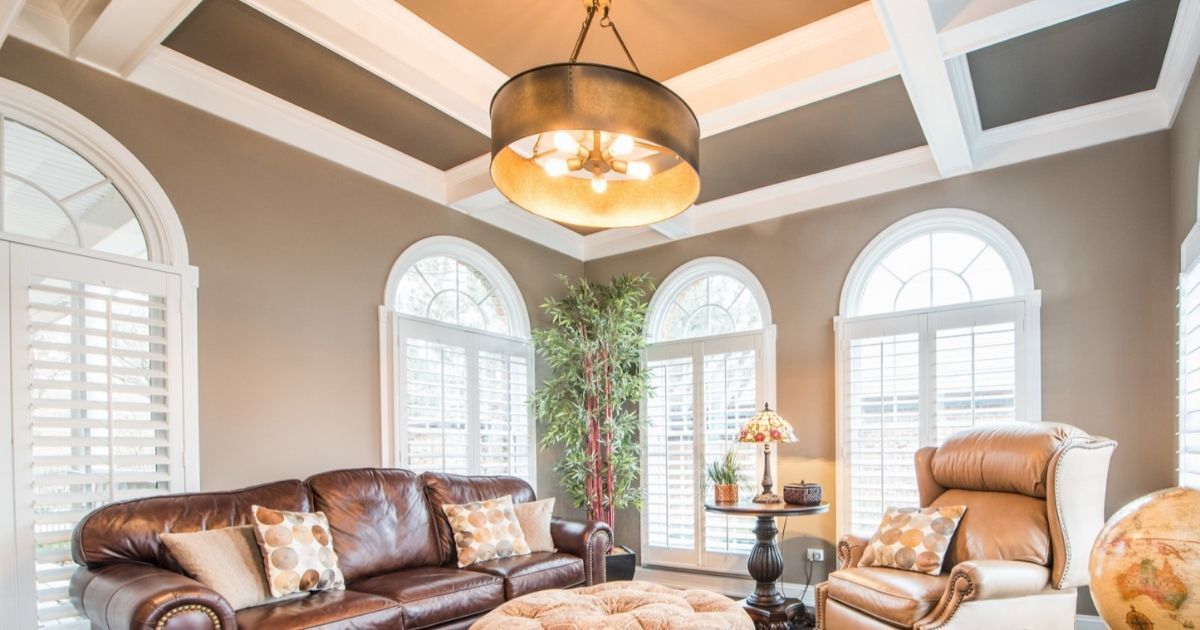
Deep & Dramatic
On the other end of the spectrum, bold colors are getting even bolder, but in a more refined, selective way. Picture deep navy, stormy charcoal, forest black, and velvety wine-red.
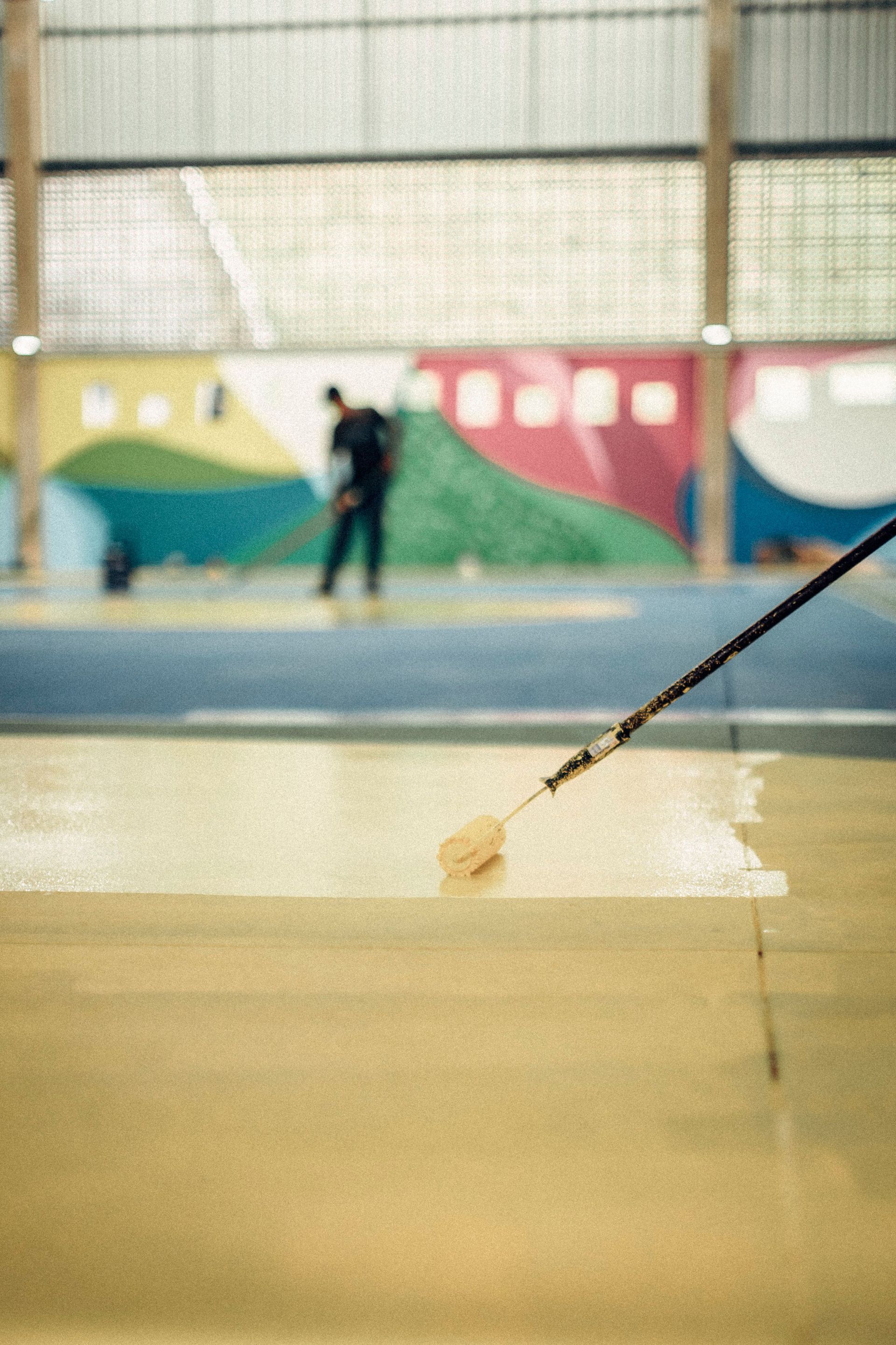
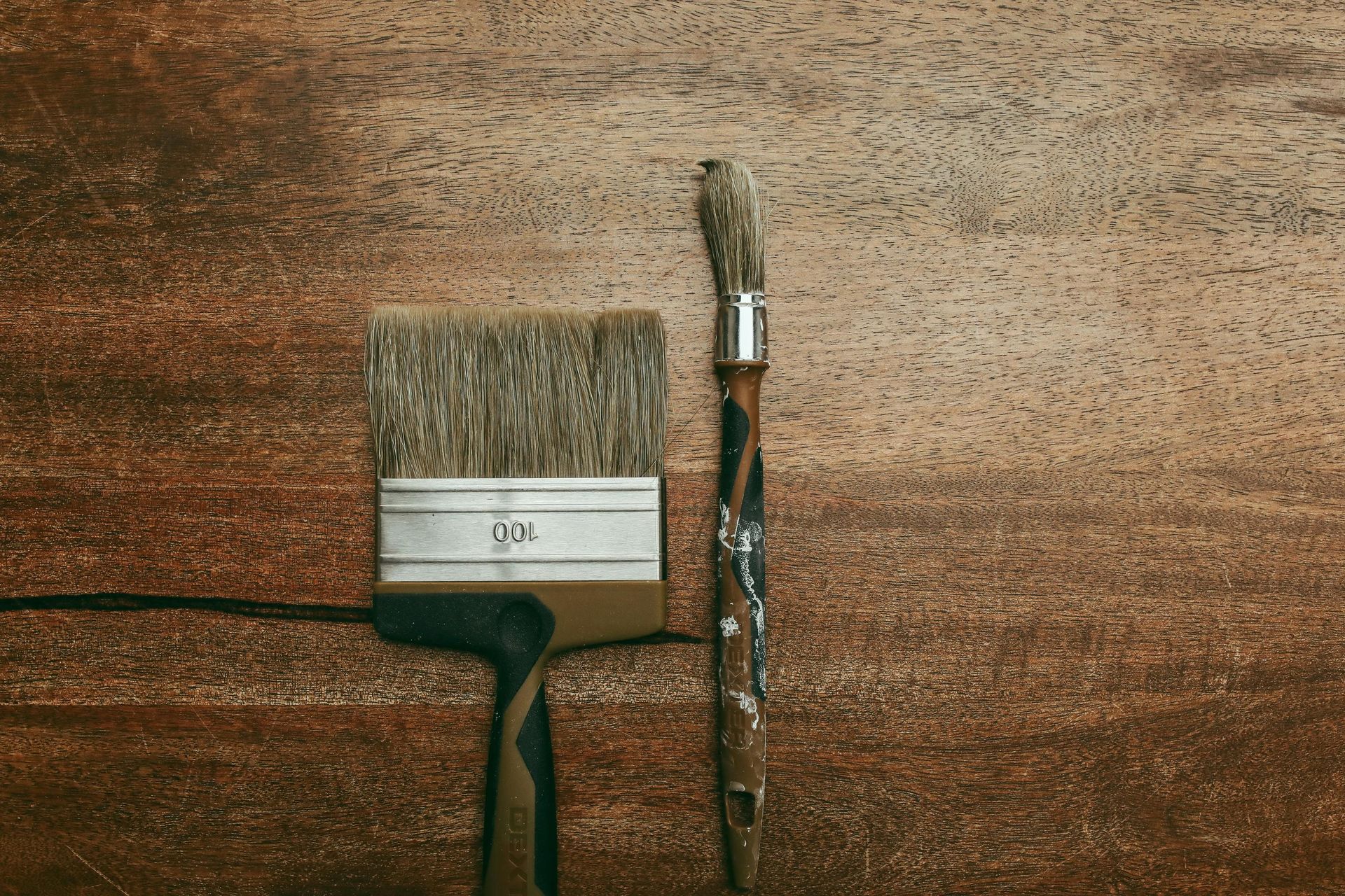
Used right, these colors won’t overwhelm. But the key word is “used right.” If you want the dramatic look but not… drama, then it may be a good idea to involve a local painter who can provide some consultation.
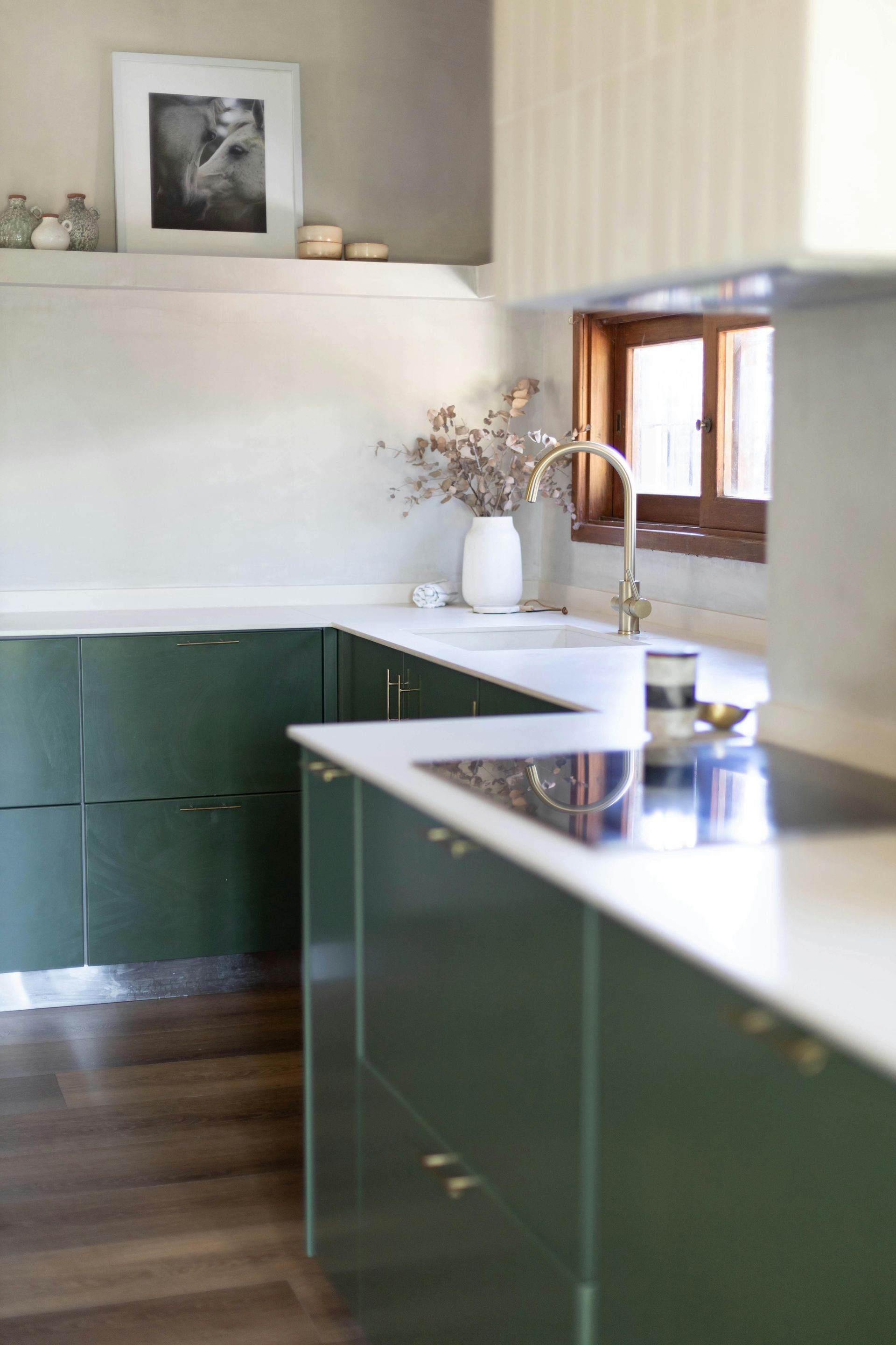
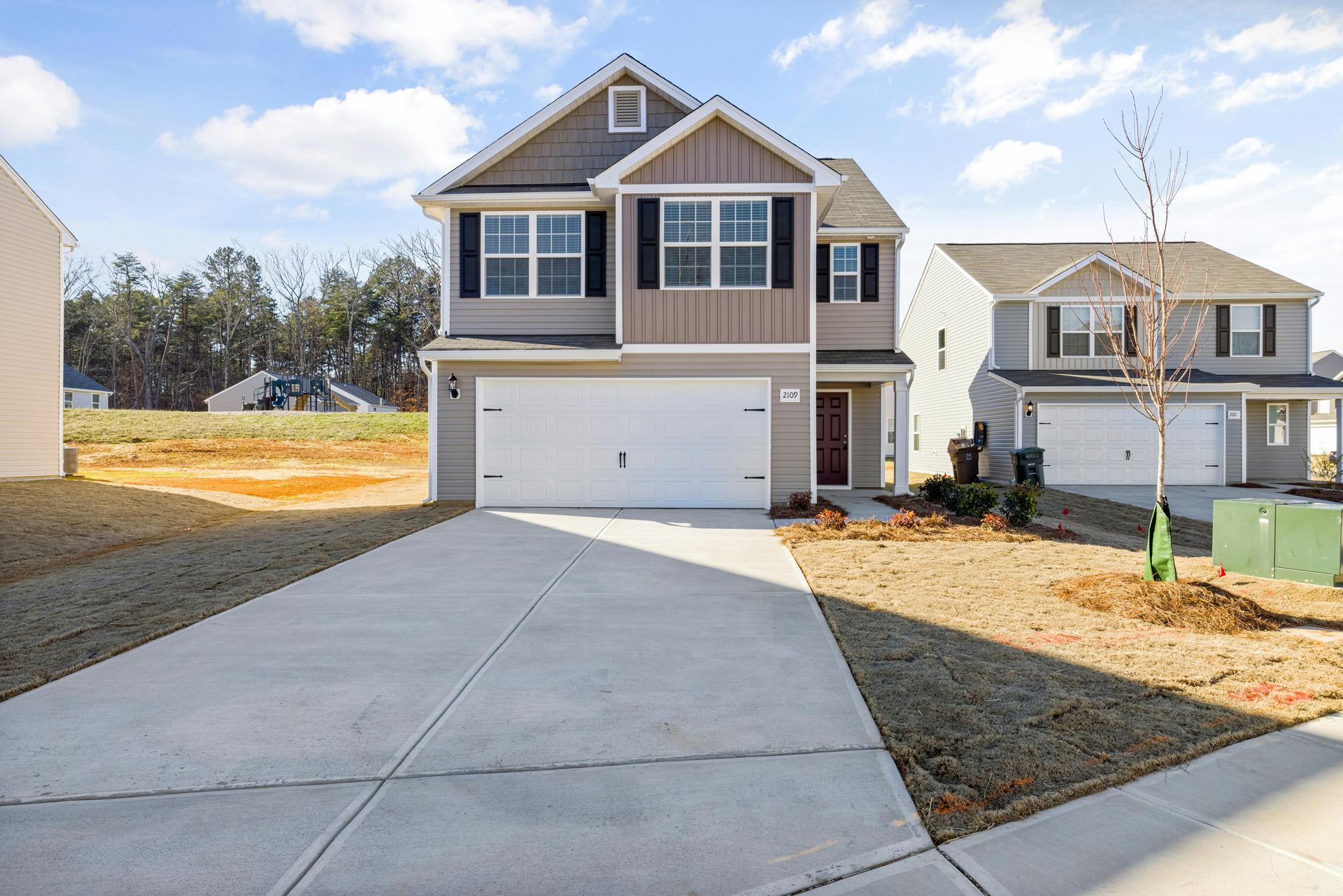
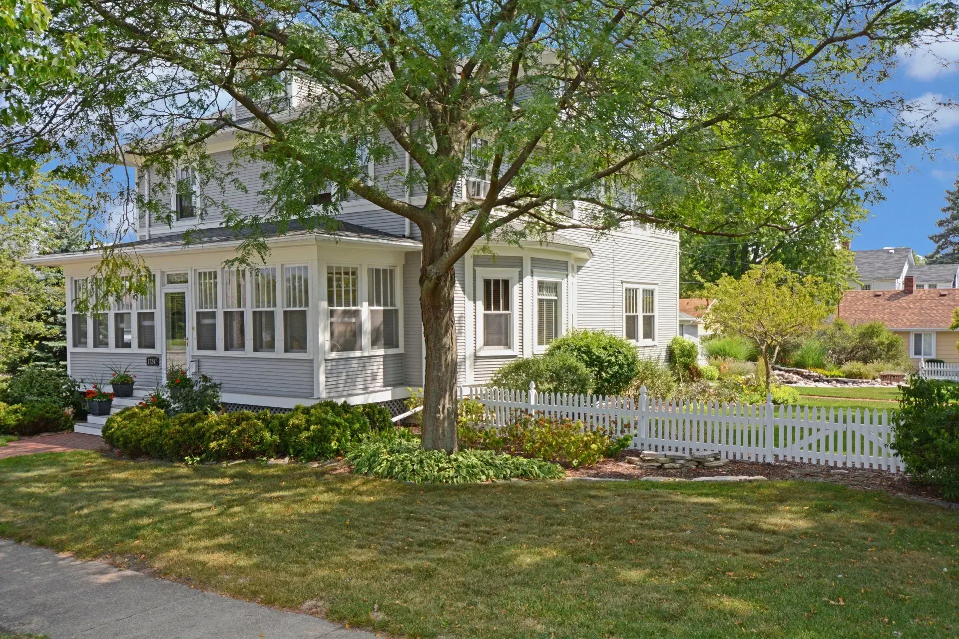
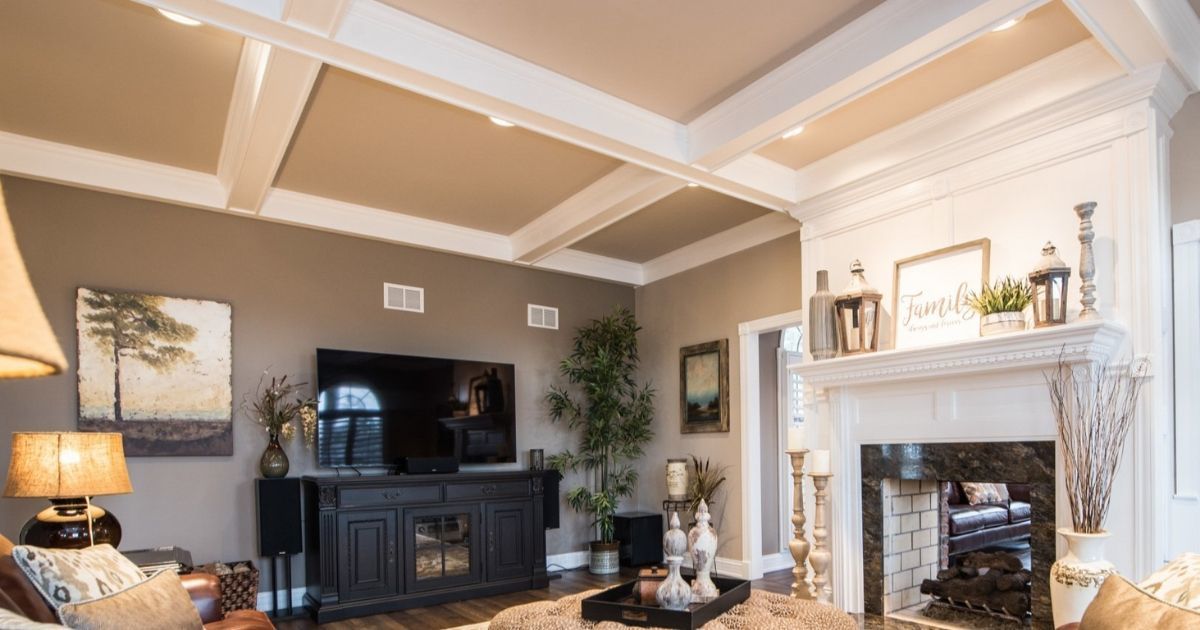
Warm Neutrals with Character
Good news if you’re allergic to stark white walls: warm neutrals are taking over.
Creamy off-whites, bone tones, and pale beiges with hints of pink or peach are quietly becoming the go-to background for both modern and traditional homes. They're soft, timeless, and — bonus — they make natural light look even better.
How to Try a Trend Without Regret
Just because something’s trending doesn’t mean you should slather it on every surface. Here are some smart ways to dip your brush into something new, without diving off the deep end.
Start Small
Want to test out a bold color? Try it in a guest bathroom, entryway, or laundry room first. Smaller spaces are lower risk and high reward.
Use Color in Unexpected Places
Not ready to repaint a whole room? Try adding color to your ceiling, trim, or even inside built-ins or bookshelves. A little surprise color can go a long way.
Sample, Don’t Gamble
We’ve said it before and we’ll say it again: buy the sample. Paint a patch. Live with it for a few days. Lighting changes everything, and what looks amazing on a screen might read “hospital hallway” on your living room wall.
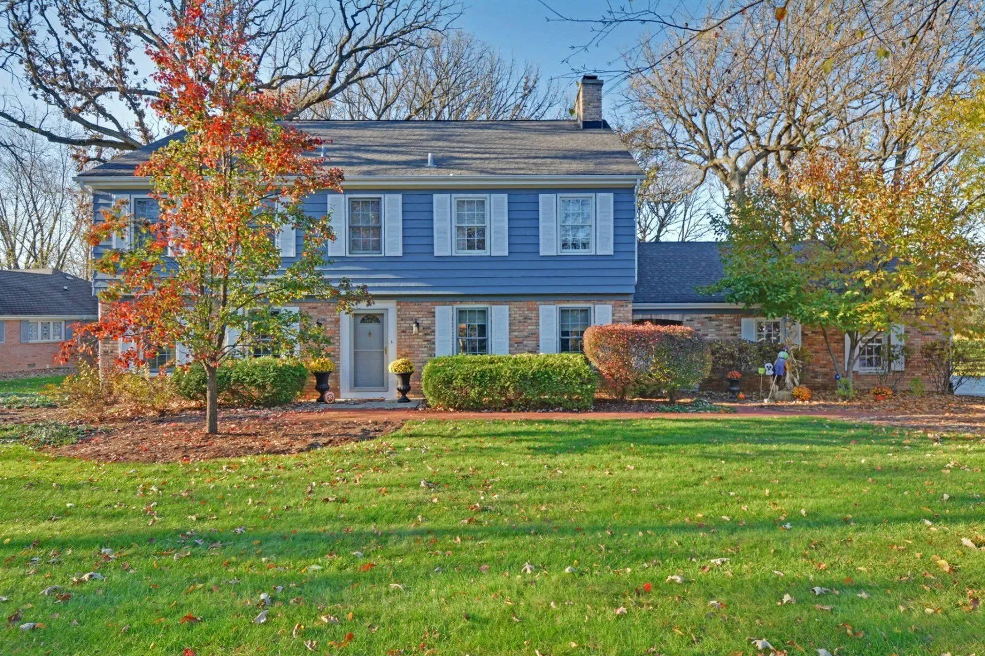
What’s Fading Out?
We’re not here to shame anyone’s color choices — every home is different, and every shade has its time to shine. That said, cool grays and icy blues are starting to step aside. The current shift is warmer, deeper, and a little more expressive.
If your home still rocks a cooler palette and you love it, great! Don’t let a random internet article make you hate it. But if you are itching for a change, now might be the perfect excuse to explore something
a little toastier.
The Takeaway?
You don’t have to be a designer, or even a DIY-er, to care about color trends. Staying in tune with what’s coming helps you make better choices now, avoid tired looks later, and maybe even fall in love with a shade you’d never have considered.
Whether it’s a soft tech blue in the bathroom or a warm neutral in the living room, 2026 is shaping up to be a year of color with character. Use it as inspiration, not a rulebook. And remember, the best paint color is the one that feels like you.
Jondec Painting
If you’re feeling inspired but not entirely sure where to start, that’s totally normal — and it’s exactly where we like to come in. At Jondec Painting, we’ve been helping homeowners in the Southwest Suburbs of Chicago bring color into their homes (and confidence into their decisions) since 1987.
We stay on top of what’s trending not because it’s trendy, but because it helps us guide our customers toward choices that feel
just right for them. So whether you’re thinking about a big change or just testing the waters, we’re here to help!
Share
Let's Talk Paint!